DIY projects just rock

I am excited to see the work DIY (http://www.diyphotography.net/) is doing on beauty dishes.  I think that photographers are inherently do-it-yourself types, so I really enjoy the inspiration from this site in particular.

Notably, getting great light from a single strobe is HUGE.  I mean really big. No one wants a photo shoot to require so much gear that a sherpa is needed. So the dish works wonderfully for environmental portraits, indoor portraits and even an occasional product shot.  I highly recommend the terra cotta version which runs about $17 to make.  Really, the key parts of this set up actually run under $10 if you can borrow some paint from Grandpas garage.

DIY did this great side-by-side comparison of two different builds. Here’s a link to the 2 beauty dishes:  http://www.flickr.com/photos/isayx3/2812691251/

I thought the results were pretty clear cut.  The right photo is livelier, brighter and carries more detail.  So I wrote about it.  Well, the folks at DIY humored me and here are my 15 minutes of fame!

Funny 🙂

Redesigned Website is a Comin'

So I’ve been busy not posting since I’m redesigning my photography website. I want my site to be set up with room to grow.  I wanted a “smart phone”, not just a phone booth of a site.  Here are my thoughts on the topic.

If you view any of the better business sites out there they have the following features in common:

1. fast upload to viewers computer – don’t forget the 14.4kb set-ups out there!

2. clean, simple design with a reasonable number of places to click – little distractions are another possibility that someone will loose their interest in your site.  keep the audience firmly planted at your site.

3. easy access to the most used pages right from the start – for example, its easy to get to the portfolio or blog with only one click from the homepage

4. easy to update with new material – not only on the blog, but also on the actual website so you can circulate out photos that don’t meet your standards/taste as you change and improve as a professional

5. content is king – your photos should be prominent and display your skill, style and dedication to the art and business

These 5 guiding principles are the cornerstone for my design.  I’ll let you decide how it turned out for yourself when I publish the site!

Here are a couple of sites I visit regularly:

See local Oakland photography Maurice Ramirez’s site.  He’s got a slick eye and presents as well as anyone.

I really like the Strobist blog for current posts, but man, does that mother get busied with information and too many distraction.  This was something I was hoping to not duplicate (other than the amazing technical information).  I know this is a “blog” and not a portfolio – but I think the key principles should apply – e.g. how long will it take you to find David’s contact?  More than 2-3 clicks and you might get distracted!

Dan Winters – simple, amazing, awesome. Um, perfect… (can you tell I’m a fan)

I decided to set up my site with Wix.com, which had some nice templates and lots of room to grow.  I must admit that the online interface is decent at best, very buggy often.  I’m still working out some of those issues and hoping to finalize the site soon.

Oh yeah, I also did a little logo for the business – It was fun!

A Sense of Lightness

Morse Mountain Preserve, Maine

Morse Mountain Preserve, Maine = Black = Heavy

So I’ve always enjoyed black in photos.  That ultimate contrast color that often plays nicely with lots of white – which seems to be the most common color of webpages nowadays.  Certain functions also cater towards increasing black, I found the “clarity” slider in Lightroom, for instance, tends to increase the prominence of darker shades, lines, thus increasing “shadows”.

Black is great but it is heavy.  It can be overdone.  It can weigh on a photo like an anvil.  Heavy.

So here’s heavy on top of light (think of oil on water).  This is Sitka Spruce from Maine’s Morse Mountain Preserve – the southern range limit of this species.  Isn’t it amazing how one feels very serious, and the second photo much lighter – almost lively-er.

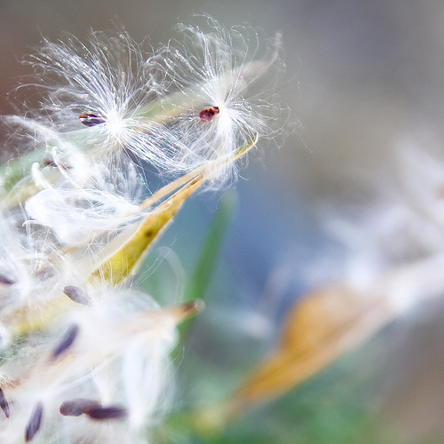
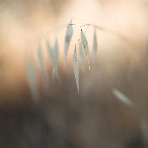
So I started thinking about the work I do – botanical photography – and I wanted to revisit whites.  White is a light color.  It adds nicely to many smaller forbes, grasses, smaller and lighter plants.  Then I came across a really special site – Angie Seckinger’s A Macro Journey.  Please do visit it.  Her triptychs are amazing.  Her eye is precise and well tuned.   She’s also a phenomenally nice person immediately asking how she could help my non-profit – Golden Hour Restoration Institute.

So here’s my thanks to Angie – and a resurrection of a sense of lightness.

stumbling onward

a whisper of fall

Thinking Double – Brett and Ali's Wedding

I attended a wonderful wedding in Guerneville, Sonoma County, over the Labor Day weekend.  Two friends, Brett and Ali, were getting married and it was truly a wonderful wedding weekend.  I was only an “attendee”, but I clicked some 700 shots that weekend.

So knowing they had an outstanding photographer (Paul C. Miller) with a great vibe, I was in great shape to do whatever I wanted! Yay!

I decided to shoot the classic portrait arrangements that Paul set up – and got some great results from a slightly different angle.  Also, more of a taste of photojournalism.

Then I also got to do a bit of photojournalism type shooting on my own.

After taking a look at the photos and the elements, I decided to try to combine a couple in double and triple exposures using Photoshop Elements 8, and final color balance with Lightroom 2.7.

Here’s what I came up with – a taste of non-traditional in the traditional wedding.

Great times – Thanks Brett and Ali for such an amazing weekend.  I feel lucky to have been a part of it!


Log into and order prints of the full set here.