So I’ve always enjoyed black in photos. That ultimate contrast color that often plays nicely with lots of white – which seems to be the most common color of webpages nowadays. Certain functions also cater towards increasing black, I found the “clarity” slider in Lightroom, for instance, tends to increase the prominence of darker shades, lines, thus increasing “shadows”.
Black is great but it is heavy. It can be overdone. It can weigh on a photo like an anvil. Heavy.
So here’s heavy on top of light (think of oil on water). This is Sitka Spruce from Maine’s Morse Mountain Preserve – the southern range limit of this species. Isn’t it amazing how one feels very serious, and the second photo much lighter – almost lively-er.
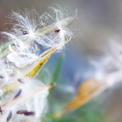
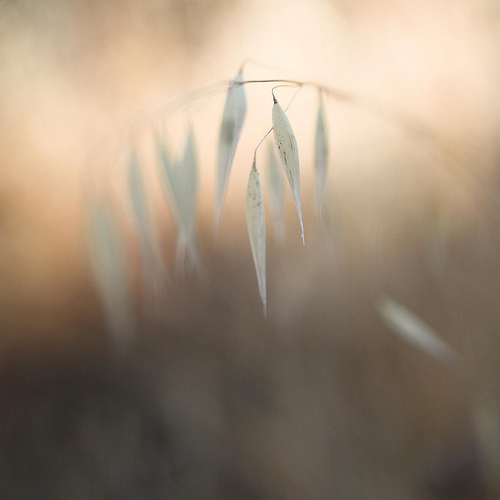
So I started thinking about the work I do – botanical photography – and I wanted to revisit whites. White is a light color. It adds nicely to many smaller forbes, grasses, smaller and lighter plants. Then I came across a really special site – Angie Seckinger’s A Macro Journey. Please do visit it. Her triptychs are amazing. Her eye is precise and well tuned. She’s also a phenomenally nice person immediately asking how she could help my non-profit – Golden Hour Restoration Institute.
So here’s my thanks to Angie – and a resurrection of a sense of lightness.


The last one is my favorite–it is so beautiful!
Thanks for the compliment! Nature is so amazing…